by Jonathan A. Handler, MD, FACEP, FAMIA
Introduction
Throughout my professional life, I have performed analyses to assess performance related to some process or function. Whether it’s the performance of people processes, machine processes, or something else, I have found a simple metric (or set of similar metrics) that seems very often to tell me the first thing I need to know and track. That is the “worst [x] percentile.” To make this less cumbersome to write, let’s call it the “WXP.” And, if referring to a specific percentile, let’s substitute that percentile in for “X” (e.g., W25P for the worst 25th percentile).
Obviously, using worst percentiles is not new. However, it seems very underutilized. I often don’t see it used in cases when I think it would be helpful, nor do I see it as frequently espoused as I think warranted. So, even though others have surely touted it, I’m doing so again here.
Please note that this post refers to the situation in which one end is “good” another end is “bad.” For example, in golf, low scores are “good” and high scores are “bad.” In bowling, high scores are “good” and low scores are “bad.” I’m specifically not referring to cases like human blood pressure, where both too low and too high are bad.
Why WXP?
I understand that, for benchmarking or other reporting purposes, averages and medians seem commonly used. I also understand why: these metrics tend to minimize the effect of outliers, so that a single or few unusual cases don’t taint a description of the “typical” situation. However, when looking for problem points and opportunities to improve, it’s the “outliers” that we often want to find. The averages and (especially) medians tend to “hide” those outliers, and their effects.
If the average and median are obviously problematic, then one might think, “we already know there’s a problem, why look further?” However, I have often found looking further useful in most of those cases. If the median is bad, then the worst 25th or 10th percentile (W25P or W10P) are often shockingly bad. Let’s say the median wait time on hold for customer support calls to be answered is 20 minutes — far longer than the business’s desired 5 minutes max. Well, guess how long it is for the W25P? Answer: There’s no way to know if only given the median. It might be 20 minutes and 5 seconds, or it might be 24 hours! What if the W25P is 21 minutes, but the W10P is 240 minutes (4 hours)? That would mean, “on average,” 1 in every 10 callers waits at least 4 hours! However bad the typical situation might be, it may be comparably wonderful compared to the situation for the 10% that suffer the most. Without the WXP, one may underestimate the severity of an issue in a substantial minority of cases, leading to an inappropriate under-prioritization of a serious issue and/or failing to act when action is needed.
Comparing the WXP to the mean or median can often inform where improvement efforts should be focused. I almost always use a value for “X” substantially less than 50 (W50P is the same as the median). I find the W25P and the W10P commonly helpful, and occasionally also the W1P. It may be that those waiting 20-30 minutes get annoyed but won’t flee to another vendor, while those waiting 4 hours will be furious and never patronize your business again. If so, perhaps focusing on those with extreme waits would be more beneficial than focusing on those with more typical waits. Plus, the root causes of typical waits may be very different than the root causes of very long waits. If the median time is 20 minutes, and the W10P is 25 minutes, then it may be very likely that improving the typical experience (the experience for those at the median) will also improve the experience for almost all callers. However, if the median time is 20 minutes and the W10P is 240, then I’d strongly suspect something very different is happening for those 10% of callers, and that addressing the experience for the typical caller will do little to help those suffering the worst 10% of call wait times.
What About Other Metrics?
Let’s look at some other metrics and why I have found them less frequently helpful. We’ve already discussed mean (average) and median, so I won’t re-address them here.
Standard Deviation (SD)
Don’t get me wrong, this is often helpful. However, interpretation becomes more complicated if the data does not follow a “bell curve” (a.k.a., standard, or normal distribution). Very often, the data is heavily skewed, having a significant tail in the “bad” direction. People tend to think that a normal distribution can be assumed if there’s a lot of data, but that does not always hold true. In fact, I’m not sure it’s even typical for many (maybe most) performance analyses involving human processes or interactions.
Even in cases where the data follows a normal distribution, very few people seem to know how to use a standard deviation to determine the WXP. The “68-95-99.7 rule” (aka the “empirical rule”) says that, if the data follows a normal distribution, then about 68% of the data will fall within 1 SD of the mean, about 95% will fall within 2 SD, and about 99.7% will fall within 3 SD. So, if 1 SD covers 68% of the data, then 32% of the data falls outside of 1 SD. Half of that (16%) is on the “good” side, and the other half (16%) is on the “bad” side. If higher values are worse, then the mean plus 1 SD gives the value for the worst 16th percentile (W16P). If lower values are worse, then the mean minus 1 SD gives the value for the worst 16th percentile (W16P). Similarly, if 2 SD covers 95% of the data, then 5% of the data is outside of 2 SDs, and half of that (2.5%) is on the “bad” side. So, the mean + 2 times the SD provides the W2.5P when higher values are worse, and mean – 2 SD gives the W2.5P when lower values are worse.
However, this rule cannot be confidently applied if the data is not normally distributed (e.g., the data is skewed). In a non-normal, non-symmetrical distribution, the empirical rule may make the problem look significantly more or less serious than it actually is (in my experience, most often less serious than the true value).
So, how many people who will be consuming the data (data consumers) will know the empirical rule? How many of them will know that it only can be confidently applied in normal distributions? How many of them will know whether the underlying data has a normal distribution?
Even in the best case scenario, where the data is known to be normally distributed and where the users know how to calculate the W16P, or W2.5P based on the empirical rule, why force the data consumers to do that work? Why not just do the calculations for them? So, I prefer one or more WXPs to the SD (though I’m often happy to have both!).
Percent at Target
This seems to be a commonly used metric of performance, and it provides a useful mechanism to understand how often your desired performance target is met. However, for identifying, managing, and quantifying the impact of major problems, I haven’t often found this metric as useful as the WXP.
Imagine that you want all calls to be answered within 5 minutes, max. You have two teams:
- Team A: 99% of calls are answered between 5 minutes and 1 second and 5 minutes and 30 seconds. Only 1% of calls are answered at 5 minutes or less.
- Team B: 40% of calls are answered in under 5 minutes, but the other 60% of callers wait more than an hour on hold.
Which team is performing better? Team A is only 1% at or below target, while Team B is 40%. So… bonuses for Team B, and demotions for Team A? Maybe the metric really does show that Team B is performing better for your needs. For example, maybe the business only gets paid if the call is answered in under 5 minutes. However, for most scenarios I have seen, Team A would be considered to have superior performance compared to Team B, even though the metrics would strongly suggest otherwise.
Histogram or Sorted Index Plot
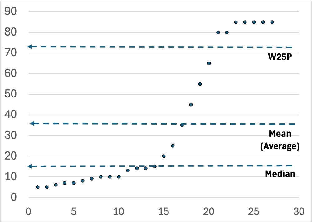
Note: In the graph at the top of this post, the x-axis is the index of an item, assigned by sorting the items by their y-axis values. ChatGPT recommended “sorted index plot” for describing this type of graph, so I hope it was right!
If you provide a histogram or a sorted index plot, then theoretically, the data consumer can estimate the WXP for any value of X from the graph. However, in reality, it often seems very difficult to guess a WXP using these graphs. To get the WXP from a histogram requires estimating and comparing the area under part of the graph to the area under the entire graph (pics on this site seem to show this nicely). To get the WXP from a sorted index plot requires comparing counts of dots above a line in the plot to the count of all dots in the plot (as shown in the pic at the top of this post). For symmetrical, non-skewed distributions, it may be somewhat feasible to estimate a WXP, but when the distributions are skewed I think it gets very difficult. So, although I have found it helpful to show the histogram or sorted index plot in many cases, I think it’s often good to also communicate one or a few WXPs. One way to do this is to label the graph with one or more key WXPs, as I have done in the pic at the top of this blog post.
Communicating WXP
People often seem to struggle with interpreting percentages. As strange as it may seem, it’s not always obvious to people that the worst 10th percentile means, overall, one in ten suffer the worst 10th percentile. Very often, people assume that something that “only” occurs 10% of the time is super-rare. If rephrased as “1 in 10” then I have found people are much less likely to perceive it as super-rare.
For example, our weather forecast may note that the chance of rain is 10%. If it does then rain, my wife is often shocked that the forecast was so wrong! This apparently happens because many interpret 10% chance of rain as “no chance of rain” (see here and here). On the other hand, some have reported that people may overestimate the frequency when the phrasing is “1 in X” (like “1 in 10”) rather than “10%” or “10 in 100,” although the overestimation also may be smaller than previously described, especially for those with “high numeracy.” Anecdotally, my experience is that people tend to dismiss small but substantial percentages. Reminding them that, “on average,” 1 in X will be in the WXP often makes it more real and relatable. Therefore, I try to provide it both ways, as the both the WXP and as the “1 in X”.
Also, people tend not to realize that the WXP represents the best value among that group, and that almost all in that WXP group will have a worse value, potentially much worse. For example, if the W10P for callers to a call center is 4 hours, then 10% (or 1 in 10) callers have at least a 4 hour wait. Therefore, I try to communicate that with the WXP as well.
So, if the W25P is 3 hours, then I will usually say something like:
“The worst 25th percentile is 3 hours, meaning that, on average, 1 in 4 wait a minimum of 3 hours.”
In a single, short sentence, it conveys the problem clearly, objectively, and accurately, using two different metric forms (percentile and “1 in X”), while also conveying that the value represents a best-case scenario for the WXP group.
Conclusion
There are many metrics for many uses. Here, I’ve discussed one that I often find really useful. Although I frequently use many other metrics, including averages, standard deviations, and medians, I see those common metrics used much more often than the WXP in performance analyses. For that reason, I chose to focus on the WXP in this post. Are there other metrics that might be even more useful when evaluating performance? Sure! And if so, please feel free to share those in the comments.
All opinions expressed here are entirely those of the author(s) and do not necessarily represent the opinions or positions of their employers (if any), affiliates (if any), or anyone else. The author(s) reserve the right to change his/her/their minds at any time.

Leave a comment